

Responsive Footers built with Bootstrap 5. Free footer templates with different options like bottom fixed footer, sticky footer, social media,
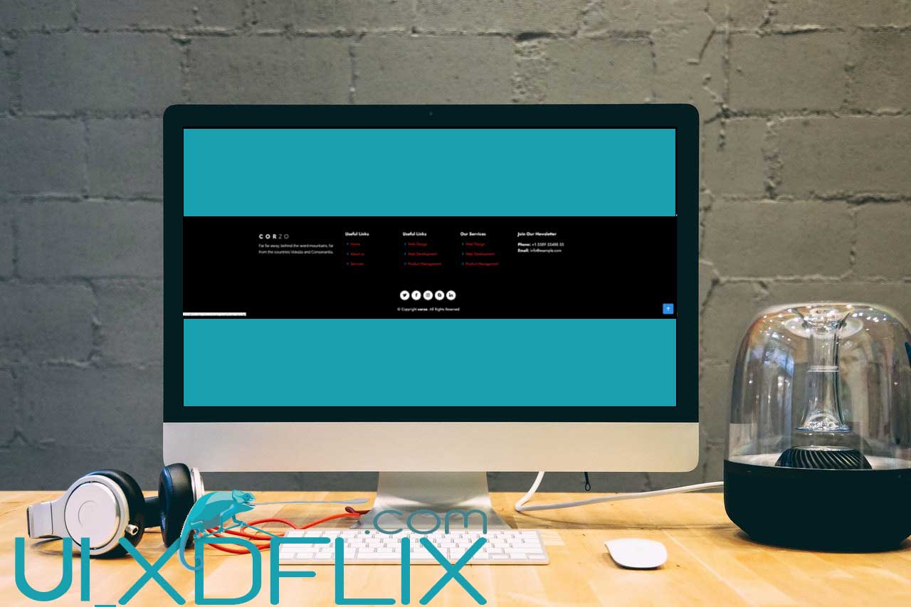 |
| How make footer Responsive in Bootstrap |
Html
<!-- ======= Footer ======= -->
<footer id="footer">
<div class="footer-top">
<div class="container">
<div class="row">
<div class="col-lg-3 col-md-6 footer-contact">
<h3><a href="index.html" class="logo me-auto"><img src="assets/img/logox1.png" alt="" class="img-fluid"></a></h3>
<p>
Far far away, behind the word mountains, far from the countries Vokalia and Consonantia,
</p>
</div>
<div class="col-6 col-lg-2 col-md-6 footer-links">
<h4>Useful Links</h4>
<ul>
<li><i class="bx bx-chevron-right"></i> <a href="#">Home</a></li>
<li><i class="bx bx-chevron-right"></i> <a href="#">About us</a></li>
<li><i class="bx bx-chevron-right"></i> <a href="#">Services</a></li>
</ul>
</div>
<div class="col-6 col-lg-2 col-md-6 footer-links">
<h4>Useful Links</h4>
<ul>
<li><i class="bx bx-chevron-right"></i> <a href="#">Web Design</a></li>
<li><i class="bx bx-chevron-right"></i> <a href="#">Web Development</a></li>
<li><i class="bx bx-chevron-right"></i> <a href="#">Product Management</a></li>
</ul>
</div>
<div class="col-6 col-lg-2 col-md-6 footer-links">
<h4>Our Services</h4>
<ul>
<li><i class="bx bx-chevron-right"></i> <a href="#">Web Design</a></li>
<li><i class="bx bx-chevron-right"></i> <a href="#">Web Development</a></li>
<li><i class="bx bx-chevron-right"></i> <a href="#">Product Management</a></li>
</ul>
</div>
<div class="col-6 col-lg-3 col-md-6 footer-newsletter">
<h4>Join Our Newsletter</h4>
<strong>Phone:</strong> +1 5589 55488 55<br>
<strong>Email:</strong> info@example.com<br>
</div>
</div>
</div>
</div>
<div class="container py-4 text-center">
<div class="me-md-auto text-center text-md-start">
<div class="social-links text-center">
<a href="#" class="twitter"><i class="bx bxl-twitter"></i></a>
<a href="#" class="facebook"><i class="bx bxl-facebook"></i></a>
<a href="#" class="instagram"><i class="bx bxl-instagram"></i></a>
<a href="#" class="google-plus"><i class="bx bxl-skype"></i></a>
<a href="#" class="linkedin"><i class="bx bxl-linkedin"></i></a>
</div>
<div class="copyright text-center mt-4">
© Copyright <strong><span>corzo</span></strong>. All Rights Reserved
</div>
</div>
</div>
</footer><!-- End Footer -->
(code-box)
Css
#footer {
color: #fff;
font-size: 14px;
background: #000;
}
#footer .footer-top {
padding: 60px 0 30px 0;
background: #000;
/* box-shadow: 0px 2px 15px rgba(25, 119, 204, 0.1);*/
}
#footer .footer-top .footer-contact {
margin-bottom: 30px;
}
#footer .footer-top .footer-contact h4 {
font-size: 22px;
margin: 0 0 30px 0;
padding: 2px 0 2px 0;
line-height: 1;
font-weight: 700;
}
#footer .footer-top .footer-contact p {
font-size: 14px;
line-height: 24px;
margin-bottom: 0;
font-family: "Raleway", sans-serif;
color: #fff;
}
#footer .footer-top h4 {
font-size: 16px;
font-weight: bold;
color: #fff;
position: relative;
padding-bottom: 12px;
}
#footer .footer-top .footer-links {
margin-bottom: 30px;
}
#footer .footer-top .footer-links ul {
list-style: none;
padding: 0;
margin: 0;
}
#footer .footer-top .footer-links ul i {
padding-right: 2px;
color: #1c84e3;
font-size: 18px;
line-height: 1;
}
#footer .footer-top .footer-links ul li {
padding: 10px 0;
display: flex;
align-items: center;
}
#footer .footer-top .footer-links ul li:first-child {
padding-top: 0;
}
#footer .footer-top .footer-links ul a {
color: #d32525;
transition: 0.3s;
display: inline-block;
line-height: 1;
}
#footer .footer-top .footer-links ul a:hover {
text-decoration: none;
color: #d32525;
}
#footer .footer-newsletter {
font-size: 15px;
}
#footer .footer-newsletter h4 {
font-size: 16px;
font-weight: bold;
color: #fff;
position: relative;
padding-bottom: 12px;
}
#footer .footer-newsletter form {
margin-top: 30px;
background: #fff;
padding: 6px 10px;
position: relative;
border-radius: 50px;
text-align: left;
border: 1px solid #bfdcf7;
}
#footer .footer-newsletter form input[type=email] {
border: 0;
padding: 4px 8px;
width: calc(100% - 100px);
}
#footer .footer-newsletter form input[type=submit] {
position: absolute;
top: 0;
right: 0;
bottom: 0;
border: 0;
background: none;
font-size: 16px;
padding: 0 20px;
background: #d32525;
color: #fff;
transition: 0.3s;
border-radius: 50px;
}
#footer .footer-newsletter form input[type=submit]:hover {
background: #1c84e3;
}
#footer .credits {
padding-top: 5px;
font-size: 13px;
color: #444444;
}
#footer .social-links a {
font-size: 18px;
display: inline-block;
background: #fff;
color: #000;
line-height: 1;
padding: 8px 0;
margin-right: 4px;
border-radius: 50%;
text-align: center;
width: 36px;
height: 36px;
transition: 0.3s;
}
#footer .social-links a:hover {
background: #1c84e3;
color: #fff;
text-decoration: none;
}
(code-box)


